Microsoft changes its default typeface for only the second ever time
Microsoft is changing its default typeface for only the second ever time. For 15 years, Microsoft Office and other software has opened with one particular typeface: Calibri. By virtue of being the default look on some of the world’s most popular software, it might have been seen more than any other set of letters. Before that, Microsoft’s documents started with Times New Roman, a typeface that itself became famous largely as a result of being the default option. Now, however, Microsoft is moving on. Microsoft said that it had taken the decision in part because the technology used to display the typeface had changed, and that it needed to update for the higher resolution screens that are used today. And it is doing so with “Aptos”, a new font that was specially commissioned for the company, in a process it described as “exciting, but also intimidating”. It had done so with a view to finding a new font that could replace Calibre and have “sharpness, uniformity, and be great for display type”. Microsoft initially commissioned five new fonts, with the hope that one of them would become the default: Bierstadt, Grandview, Seaford, Skeena, and Tenorite. It added all of them to its software and allowed people to choose them from the picker and give feedback. Based on that information, Microsoft chose “Bierstadt”, and renamed it Aptos, though it will still live on under the old name too. The other fonts that lost out will also stay in the drop-down picker. Aptos will become the default typeface on Microsoft’s software, such as 365, which itself has replaced the well known Office suite. That will mean becoming the default font on Word, Outlook, PowerPoint and Excel and be seen by the hundreds of millions of people who use the software. The rollout will take place over the “next few months”, the company said. The font was named Aptos by its designer, Steve Matteson, after a town in Santa Cruz, where Microsoft said the “widely ranging landscape and climate epitomizes the font’s versatility”. The font was designed with “humanity”, Mr Matteson said, and with a view to allowing it to be “more universal and less mechanical or institutional”, he said in a blog post by Microsoft. For those that don’t like the new font, Microsoft has always offered the option to change the default font – including back to Calibri or Times New Roman. Read More Microsoft’s attempt to buy Call of Duty developer reaches huge new development Twitter starts making payments to its most controversial users What striking Hollywood writers and actors fear about AI replacing roles
Microsoft is changing its default typeface for only the second ever time.
For 15 years, Microsoft Office and other software has opened with one particular typeface: Calibri. By virtue of being the default look on some of the world’s most popular software, it might have been seen more than any other set of letters.
Before that, Microsoft’s documents started with Times New Roman, a typeface that itself became famous largely as a result of being the default option.
Now, however, Microsoft is moving on. Microsoft said that it had taken the decision in part because the technology used to display the typeface had changed, and that it needed to update for the higher resolution screens that are used today.
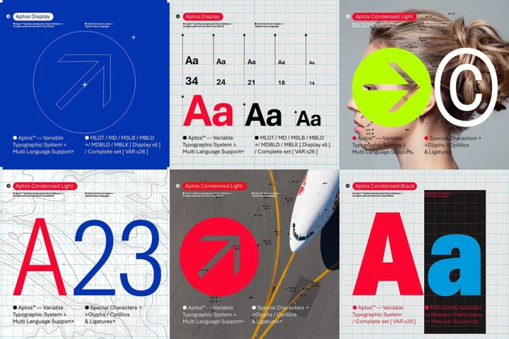
And it is doing so with “Aptos”, a new font that was specially commissioned for the company, in a process it described as “exciting, but also intimidating”. It had done so with a view to finding a new font that could replace Calibre and have “sharpness, uniformity, and be great for display type”.
Microsoft initially commissioned five new fonts, with the hope that one of them would become the default: Bierstadt, Grandview, Seaford, Skeena, and Tenorite. It added all of them to its software and allowed people to choose them from the picker and give feedback.
Based on that information, Microsoft chose “Bierstadt”, and renamed it Aptos, though it will still live on under the old name too. The other fonts that lost out will also stay in the drop-down picker.
Aptos will become the default typeface on Microsoft’s software, such as 365, which itself has replaced the well known Office suite. That will mean becoming the default font on Word, Outlook, PowerPoint and Excel and be seen by the hundreds of millions of people who use the software.
The rollout will take place over the “next few months”, the company said.
The font was named Aptos by its designer, Steve Matteson, after a town in Santa Cruz, where Microsoft said the “widely ranging landscape and climate epitomizes the font’s versatility”. The font was designed with “humanity”, Mr Matteson said, and with a view to allowing it to be “more universal and less mechanical or institutional”, he said in a blog post by Microsoft.
For those that don’t like the new font, Microsoft has always offered the option to change the default font – including back to Calibri or Times New Roman.
Read More
Microsoft’s attempt to buy Call of Duty developer reaches huge new development
Twitter starts making payments to its most controversial users
What striking Hollywood writers and actors fear about AI replacing roles